Our role focused on a complete redesign of the user interface and improvements to overall usability. Although the branding update and development (both front and back-end) were handled in-house, we were responsible for translating the refreshed brand into a modern, scalable UI. This included usability evaluation, interaction design, and the creation of a comprehensive design system to support future growth.
We started with benchmarking, comparing user journeys and standards across fintech, banking, and media platforms. Then, we conducted stakeholder interviews and led co-creation sessions with the client’s marketing and design teams. We worked as a single design squad — integrating our team with theirs — and carried out several UX review cycles.
Key actions included:
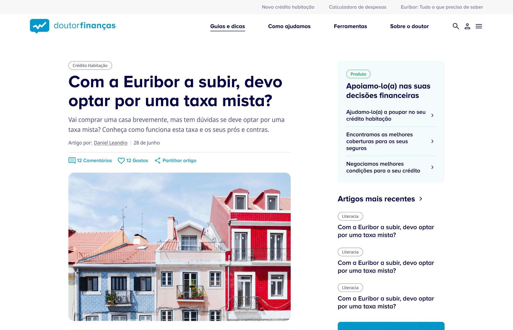
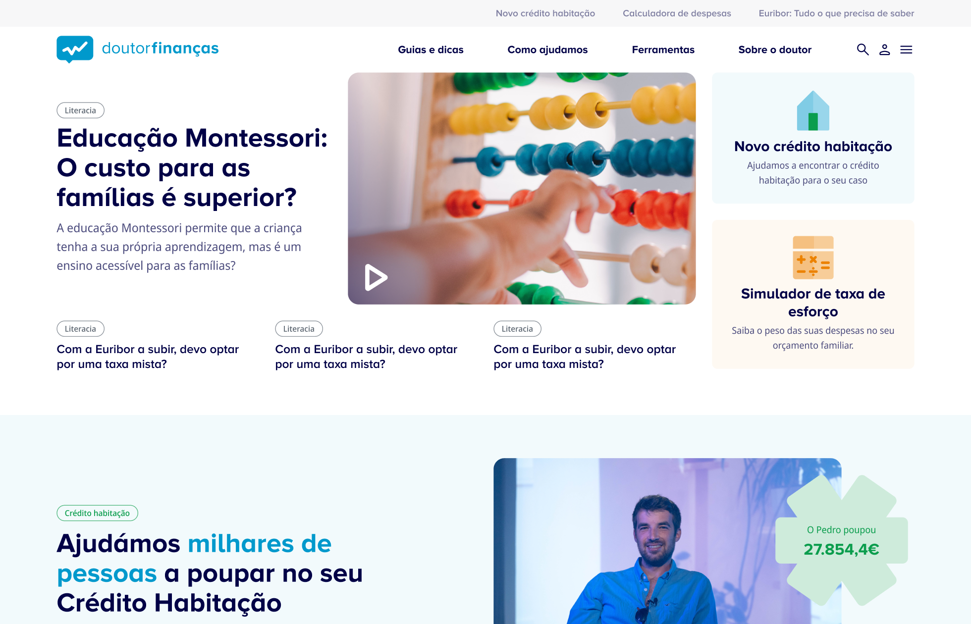
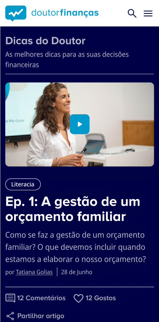
• Reorganising content architecture into four clear areas: Services, Tools, Financial Literacy, and Institutional Content
• Running heuristic evaluations and prioritising usability fixes
• Mapping user flows to improve content access and conversion
• Leading design sprints focused on simulators and tools
Throughout the project, we maintained close communication with product leadership. Each design iteration aligned with business goals and internal feedback.
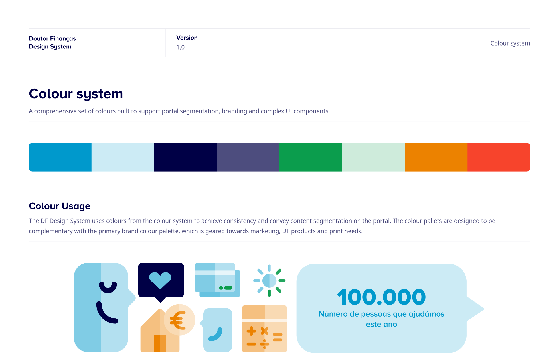
One of our most important deliverables was a modular, scalable design system. We built it with long-term maintainability in mind, enabling the internal team to:
• Launch new content faster
• Maintain consistent branding across the platform
• Manage page templates with less reliance on designers
• Transition smoothly from legacy components to the new system
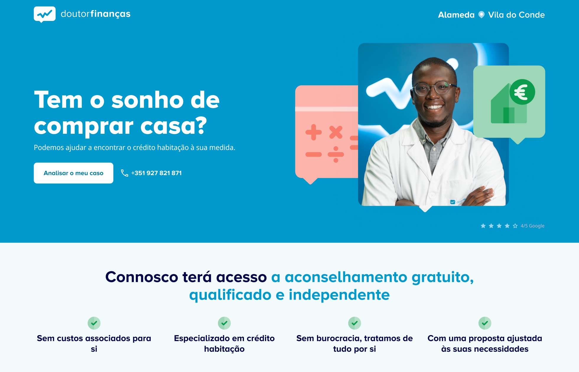
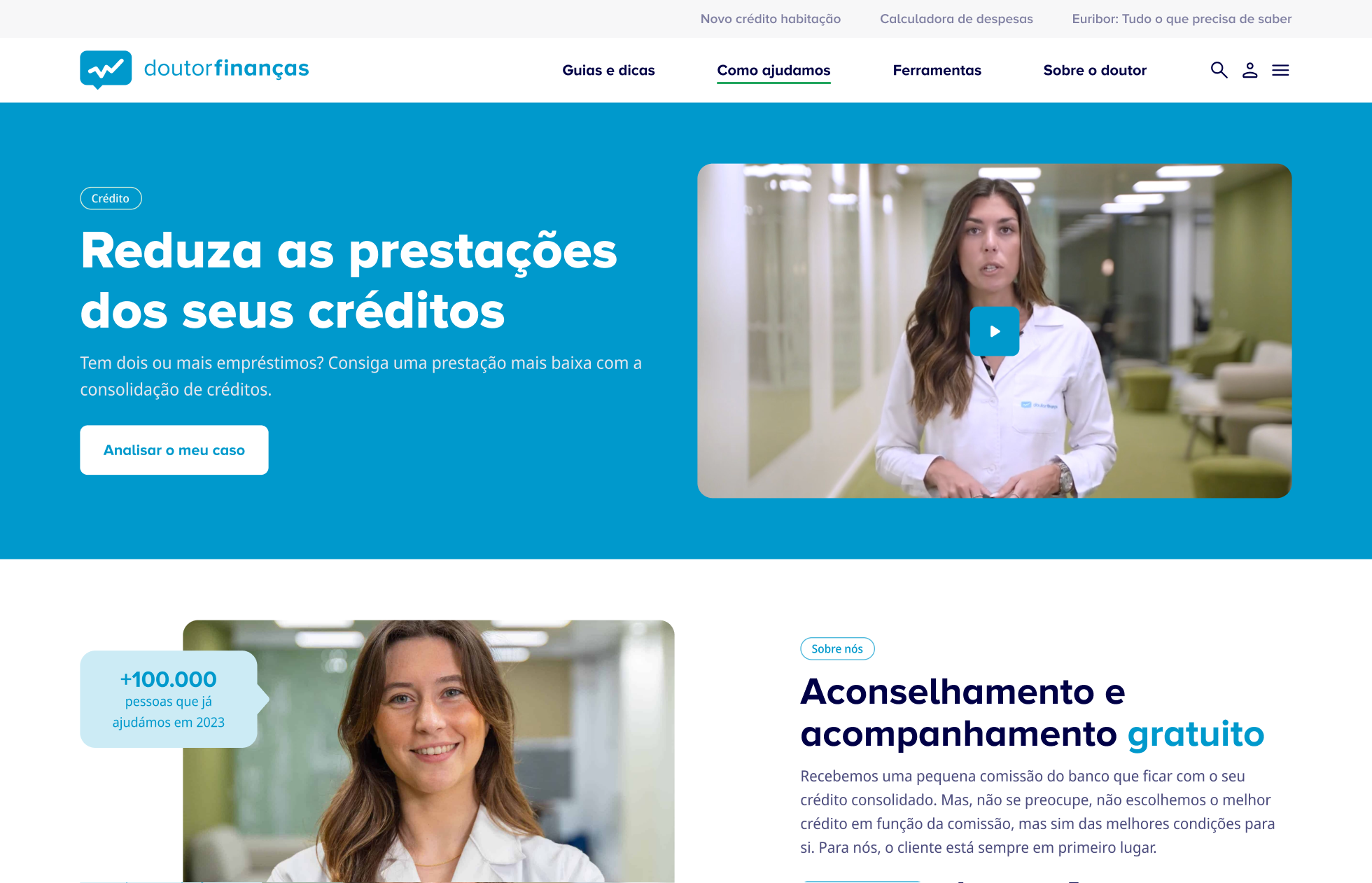
We carefully translated the updated brand — a subtle visual refresh — into a coherent and functional design language for digital use.
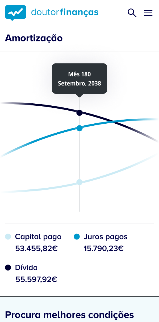
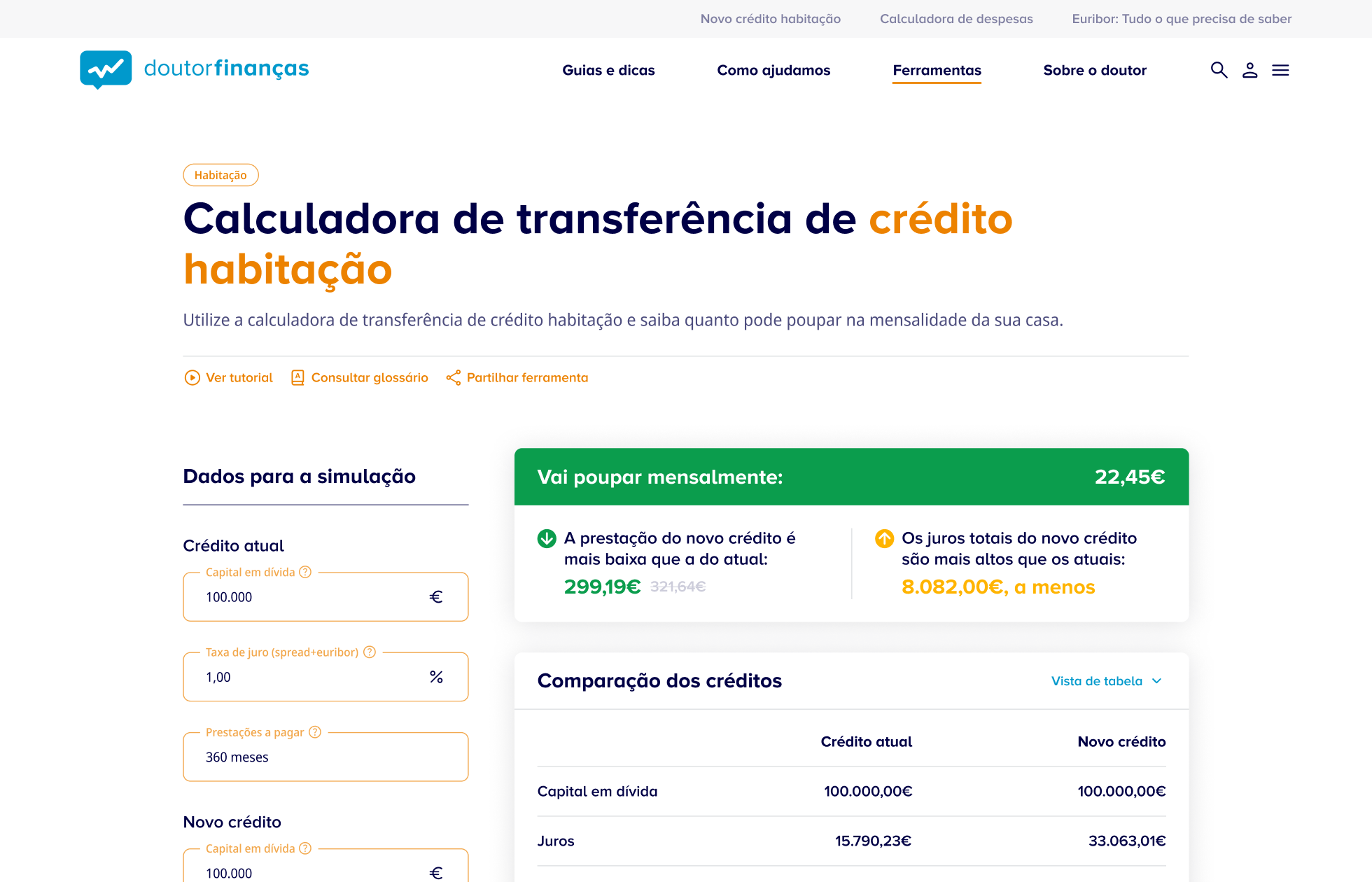
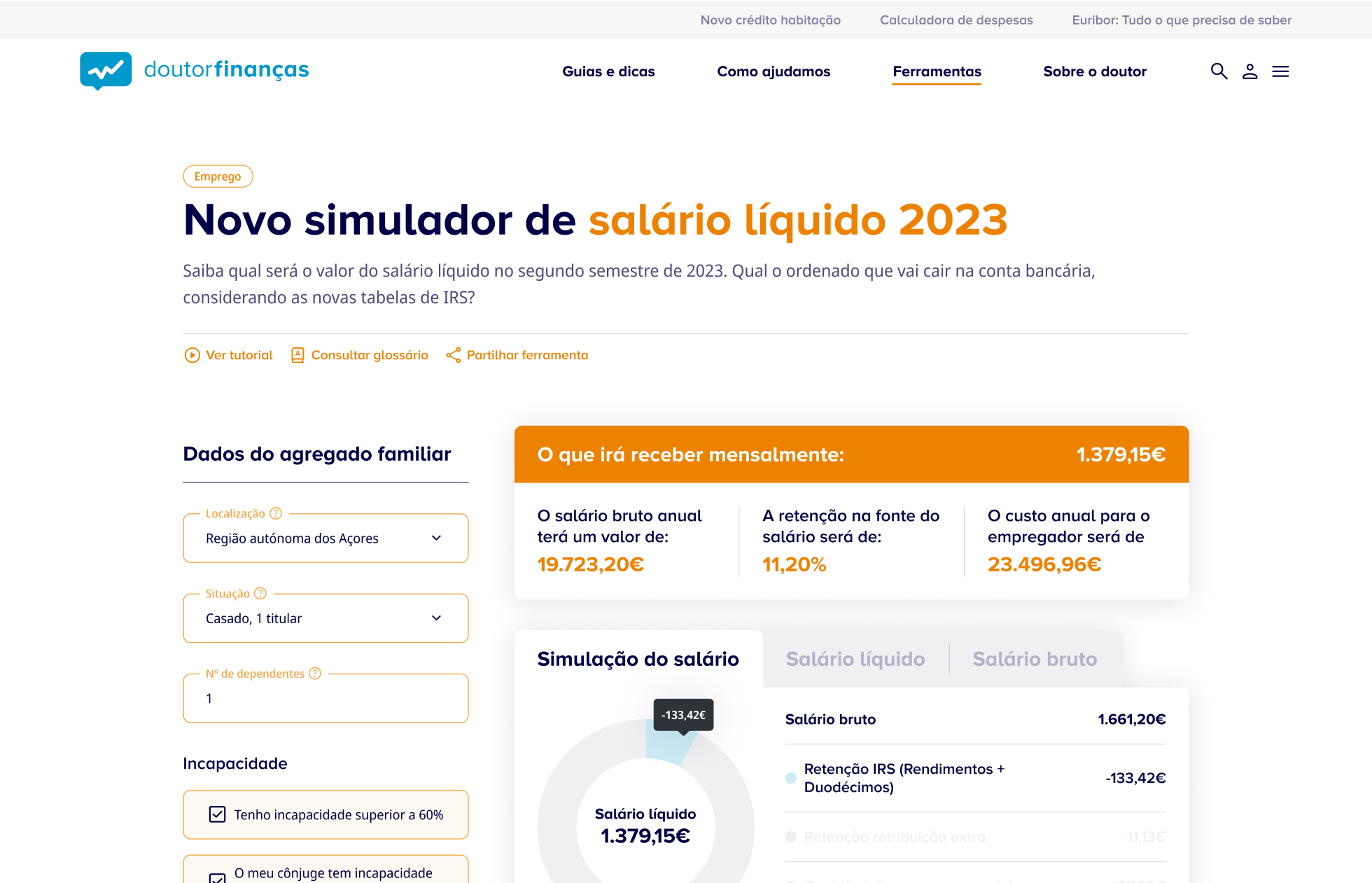
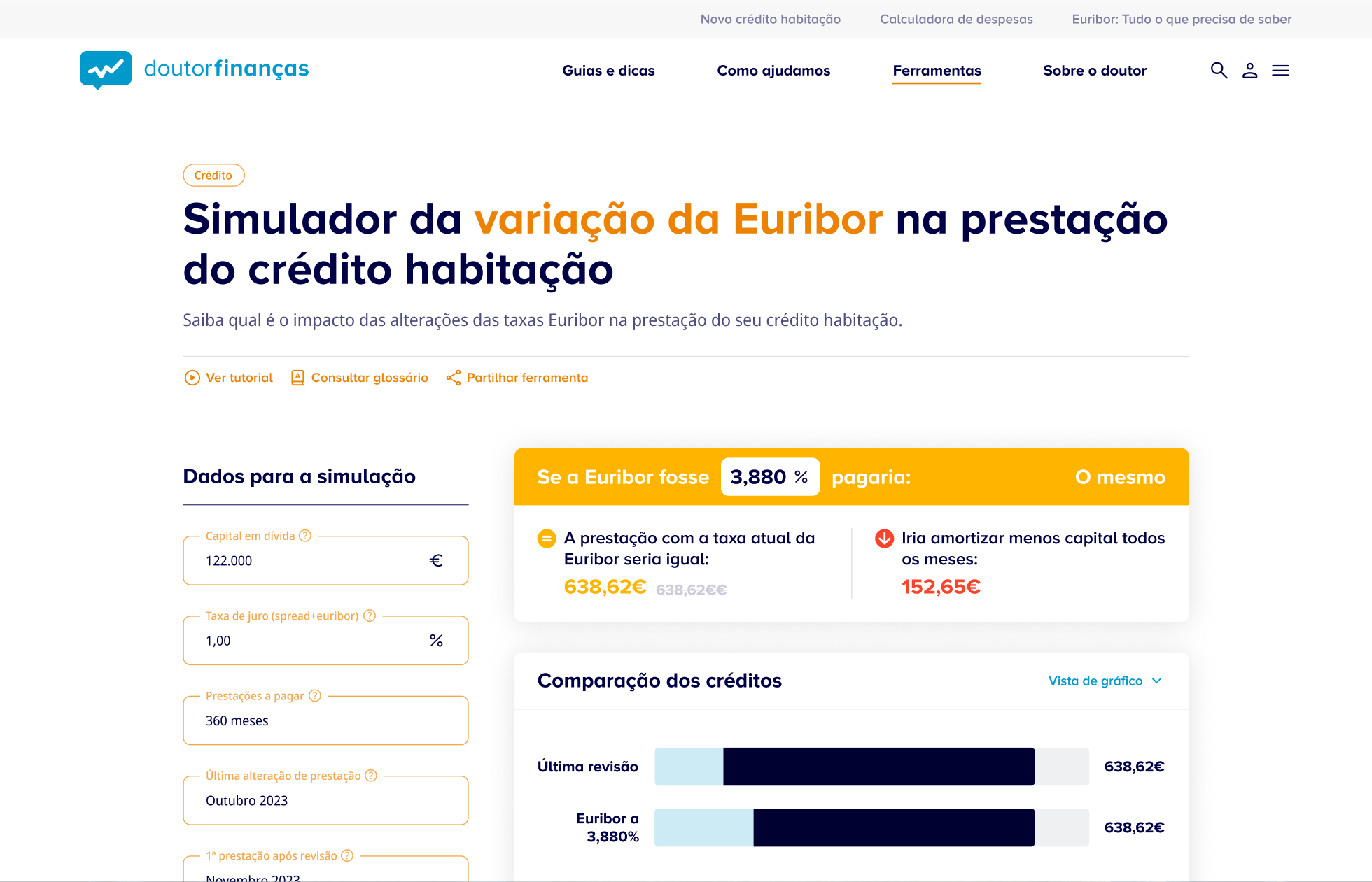
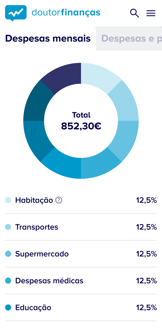
Financial simulators are among Doutor Finanças’ most visited features. These tools help users estimate mortgages, simulate savings, and evaluate financial decisions. As key conversion points, they needed special attention.
We redesigned each simulator with three priorities:
• Clarity of use: Inputs and results now appear side-by-side to minimise scrolling
• Ease of interpretation: A colour-coded results system improves readability and user confidence
• Better content: Microcopy was rewritten using UX writing best practices, enhancing clarity and trust
This 18-month collaboration involved a project manager and two designers from our team. We worked through multiple cycles of prototyping and validation, maintained weekly check-ins with product and marketing teams, and stayed aligned with the client’s internal team at every stage.
The new platform launched in June 2025 and is now fully live across all content and service areas. The in-house team continues to evolve and optimise it using the design foundations we delivered.